Your house sign is one of the first things people notice before they even step inside your home. Whether it’s mounted beside the front door, displayed at the gate, or fixed on a wall, a well-designed house sign adds personality, improves visibility, and creates a strong first impression. But many homeowners unknowingly make design mistakes that make even expensive signs look cheap, outdated, or difficult to read.
A poorly designed house sign can ruin your property’s appearance, reduce readability, and even make deliveries or guests struggle to find your home. The good news is that most of these mistakes are avoidable with the right design choices.
In this guide, we’ll cover the top design mistakes that ruin your house sign’s look and explain how to avoid them to create a stylish, practical, and long-lasting sign for your home.
Why Your House Sign Design Matters
A house sign is more than just a decorative piece. It serves both functional and aesthetic purposes. A professionally designed sign:
- Improves curb appeal
- Makes your home easier to identify
- Reflects your personal style
- Adds a premium look to your property
- Creates a welcoming first impression
Even a beautiful house can lose its visual appeal if the sign looks cluttered, faded, or poorly designed.
1. Choosing Fonts That Are Hard to Read
One of the biggest mistakes homeowners make is selecting decorative or overly stylish fonts. While fancy typography may look attractive online, it often becomes difficult to read from a distance.
Why It Ruins the Look
If visitors, delivery drivers, or emergency services cannot quickly read your house number or name, the sign fails its primary purpose.
Fonts with excessive curves, thin lines, or script styles can appear messy, especially in low light.
Better Alternative
Choose clean and modern fonts such as:
- Sans-serif fonts
- Bold lettering
- Simple uppercase styles
- Easy-to-read typography
The goal is readability first, style second.
2. Using the Wrong Size
A sign that is too small becomes invisible from the street, while an oversized sign can look awkward and overpower the entrance.
Common Problems
- Tiny house numbers
- Letters squeezed together
- The sign is disproportionate to the property size
- Poor visibility from the road
How to Fix It
The sign size should match:
- Viewing distance
- Wall or gate size
- Property style
- Mounting location
As a general rule, people should be able to read the sign clearly from the road without stopping.
3. Poor Color Contrast
Color combinations play a major role in readability and appearance. Many homeowners choose colors based only on aesthetics and ignore visibility.
Bad Color Choices Include
- Grey text on black background
- White text on light wood
- Dark blue lettering on black signs
- Metallic finishes with poor lighting
Best Practice
Use high-contrast combinations such as:
- White on black
- Black on white
- Silver on dark grey
- Gold on matte black
A good contrast improves both visibility and elegance.
4. Ignoring Lighting Conditions
Your house sign may look perfect during the day, but become invisible at night. This is especially common with non-illuminated signs placed in dark areas.
Why It Matters
If your sign cannot be seen after sunset, it reduces functionality and weakens curb appeal.
Smart Solutions
Consider:
- LED illuminated signs
- Spotlights above the sign
- Reflective finishes
- Backlit acrylic house signs
Lighting not only improves visibility but also adds a premium modern appearance.
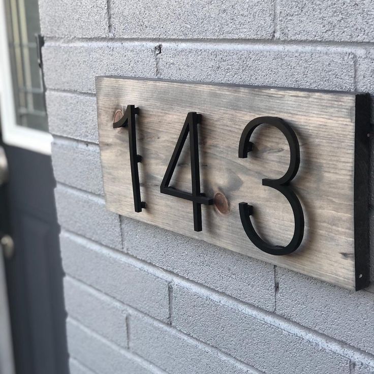
5. Choosing Cheap Materials
Low-quality materials fade, crack, rust, or peel over time. A damaged sign instantly makes the property look neglected.
Common Material Problems
- Plastic signs fading in sunlight
- Wood warping from rain
- Rust forming on untreated metal
- Cheap vinyl peeling off
Better Material Choices
Invest in durable materials such as:
- Acrylic
- Slate
- Stainless steel
- Aluminum
- Powder-coated metal
A quality sign lasts longer and maintains its appearance for years.
6. Overcrowding the Design
Some homeowners try to include too much information on a small sign. Adding decorative graphics, long text, multiple fonts, and unnecessary details creates clutter.
Signs of an Overcrowded Design
- Too many colors
- Excessive artwork
- Long family names and addresses together
- Multiple font styles
- Decorative borders everywhere
Keep It Minimal
Modern house sign design works best when it is clean and simple.
Focus on:
- House number
- Short house name
- One clear font
- Minimal decoration
Simple designs often look more expensive and elegant.
7. Picking a Style That Doesn’t Match the House
Your house sign should complement your home’s architecture. A mismatch between the sign and the property style can look strange.
Examples of Poor Matching
- Ultra-modern acrylic sign on a traditional cottage
- Rustic wood sign on a luxury modern villa
- Vintage fonts on minimalist homes
Match the Sign to the Property
For example:
Modern Homes
Choose:
- Matte black signs
- Acrylic finishes
- LED illuminated signs
- Minimal typography
Traditional Homes
Choose:
- Slate signs
- Engraved metal
- Classic serif fonts
- Natural textures
Consistency creates a polished appearance.
8. Incorrect Placement
Even the best-designed sign can fail if it’s installed in the wrong location.
Placement Mistakes
- Hidden behind plants
- Mounted too low
- Poor viewing angle
- Obstructed by gates or walls
Best Placement Tips
Your sign should be:
- Clearly visible from the road
- Installed near eye level
- Free from obstructions
- Positioned near entrances or gates
Proper placement improves both function and visual balance.
9. Neglecting Maintenance
Over time, dirt, weather exposure, and fading can reduce the appearance of your house sign.
Common Maintenance Issues
- Dust buildup
- Rust stains
- Faded paint
- Broken lighting
Easy Maintenance Tips
- Clean regularly with a soft cloth
- Check lighting every few months
- Repaint or refinish when needed
- Protect wooden signs with sealants
A well-maintained sign keeps your home looking fresh and attractive.
10. Following Trends Too Closely
Design trends change quickly. A sign that looks trendy today may feel outdated within a few years.
Risky Trend Examples
- Overly complex LED patterns
- Extreme minimalist designs with poor readability
- Trendy fonts that age badly
Better Approach
Choose timeless designs that balance style and practicality. Neutral colors, clean fonts, and simple layouts usually remain attractive for many years.
How to Create a House Sign That Looks Premium
If you want your house sign to stand out for the right reasons, focus on these essentials:
- Readable typography
- Durable materials
- Balanced sizing
- Proper lighting
- Clean layout
- High contrast colors
- Correct placement
A professionally designed sign doesn’t need to be complicated. Often, simplicity creates the most elegant result.
Final Thoughts
A house sign may seem like a small detail, but it has a major impact on your property’s appearance. The wrong font, poor lighting, cheap materials, or cluttered design can quickly ruin the overall look of your entrance.
By avoiding these common design mistakes, you can create a house sign that looks stylish, professional, and easy to read while improving your home’s curb appeal.
Whether you prefer a modern illuminated sign or a classic engraved design, the key is balancing aesthetics with practicality. A clean, durable, and well-placed sign will always leave a stronger impression than a trendy but poorly designed one.
FAQs
1. What is the best material for a house sign?
Acrylic, slate, stainless steel, and aluminum are among the best materials because they are durable, weather-resistant, and stylish.
2. Are illuminated house signs better than non-illuminated ones?
Illuminated house signs are better for visibility at night and add a modern, premium appearance, while non-illuminated signs are more traditional and budget-friendly.
3. What font is easiest to read on a house sign?
Simple sans-serif fonts with bold lettering are usually the easiest to read from a distance.
4. How big should a house sign be?
The size depends on the viewing distance and property size, but the text should be clearly visible from the street.
5. Where should I place my house sign?
The ideal location is near the entrance or gate at eye level, where it can be easily seen from the road without obstruction.